Build a simple dashboard
The repository includes reporting/dashboard.py, a Streamlit
example that reads SPRUCE-enriched Parquet output and runs interactive DuckDB
queries locally to explore cost, energy, emissions, water, region, and tag
breakdowns. Like report.py, it queries the FOCUS columns emitted by all
SPRUCE pipelines, so it works on the enriched output of every supported input
format (AWS CUR, AWS FOCUS, Azure cost details, Azure FOCUS).
Install
Run
Run the dashboard from the reporting/ directory. Point it at a local output
directory, a glob, a single Parquet file, or an S3 URI:
cd reporting
streamlit run dashboard.py -- --input ../output/
streamlit run dashboard.py -- --input '../output/**/*.parquet'
streamlit run dashboard.py -- --input s3://my-bucket/spruced/
The -- separator is required when passing dashboard arguments through
Streamlit; without it, Streamlit consumes options such as --input.
For S3 input, DuckDB uses its httpfs extension and the ambient AWS credential
chain, matching the pattern used by report.py.
To generate a small local dataset for review or demos:
python scripts/gen_synthetic.py -o output/synth.parquet
cd reporting
streamlit run dashboard.py -- --input ../output/
If output/synth.parquet already exists, pass --force to overwrite it:
Docker
Instead of installing Python and the prerequisites above, you can simply use the Docker image to launch the interactive dashboard, then open http://localhost:8501:
docker run --rm -p 8501:8501 -v $(pwd):/workspace -w /workspace \
ghcr.io/digitalpebble/spruce \
dashboard -i output
What it shows
| Section | What it shows |
|---|---|
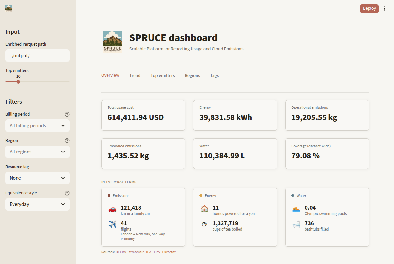
| Overview | Total usage cost, energy, operational emissions, embodied emissions, water usage, and cost coverage for the full input, plus everyday equivalences (car km, flights, home-years, cups of tea, pools, baths) |
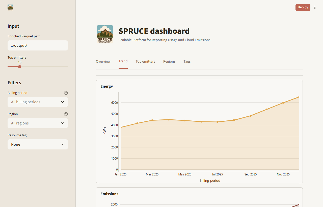
| Trend | Separate energy, total emissions, and water charts by billing period |
| Top emitters | Sorted top service/region combinations as a table-first view |
| Regions | Emissions share by region, plus regional KPI cards and detail table |
| Tags | Sorted tag-value chart and table for a selected Tags key |
Use the sidebar to filter by billing period and region. If Tags are
present, choose one tag key to break down emissions by tag value. The cost
coverage KPI matches report.py and is calculated across the full input, not
only the currently selected filters.
The "In everyday terms" block under the overview cards converts the emissions,
energy, and water totals into human-readable equivalences. The sidebar
"Equivalence style" selector switches the comparison set (Everyday, Tech, or
Nature). Conversion factors are documented, order-of-magnitude figures; edit
them in reporting/equivalences.py to change the references or add more
comparisons.
Screenshots
Customize
To add metrics or charts, edit the SQL query helpers in
reporting/dashboard.py. They match the query shapes in report.py, so
changes can usually be copied between the two.
Streamlit caches the DuckDB connection per input path during a session. When switching between several large inputs, restart the app to release old in-memory connections.
Alternatives
For a static report, use python report.py -o report.html or
python report.py -o report.pdf. For a full BI stack, point Tableau, PowerBI,
Superset, or similar tools at the same enriched Parquet output through DuckDB,
Athena, or another query layer. See the
comparison with other open source tools for broader
context.